Last night I ran another game of Dungeons & Dragons. Last session ended badly for the players — two out of four characters died during the adventure, and the other two returned to town with only the clothes on their backs.
The adventure last night all occurred in that starting town. When we began the campaign I sketched out a few details of the town. It’s defined by its geography: it’s almost surrounded by wild lands and serves as a bridge between those who hunt, trap and find artifacts in the wilderness and greater civilization. Passing travellers stay at a tavern called The Dancing Hornet. And the town is ancient — history made its mark in the architecture and artifacts that can be found here.
But until a few days ago, I hadn’t drawn a map of it!
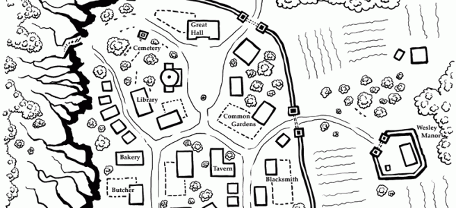
First I’ll show you the finished map. Then I’ll talk a bit about my process.
The Map
(click to see a larger size)

The Process
A list of stuff
The first thing I did was write a list of everything I knew about the town and its contents. It contained everything about the environment I mentioned a couple paragraphs ago, but also a list of buildings and features I wanted to include.
Borders
– town walls
– guard towers
– kobold cliffs (west)
– roads out of town (north & south)Building Types
– town hall
– temple
– graveyard
– tavern
– general store
– craftspeople
– smith
– baker
– carpenter
– tanner
– butcher
– libraryOut of town
– Jonas’s Manor (south east + gardens & low wall)
– hunter’s cabin (north)Layout
– farm land (outside of town to south)
– common gardens (in town)
– stables
– town square
Rough layout
Next I opened up Photoshop, got my tablet, and started sketching!
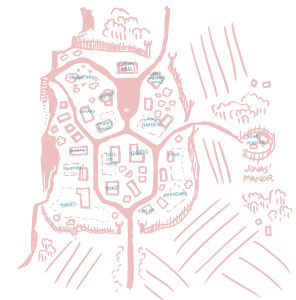
This first step was the basis for everything that came after so it was important to get it right. I’m not sure how long it took — maybe a couple hours? I made sure to take all my notes into account, drawing and re-drawing a layout that looks good, makes sense, and shows everything I want the players to know.
Those little blue scribbles are labels. I got them all!
Inking shapes
The next step was inking. I tweeted a picture while I was in the middle of it:

The whole point of this step is to get a cleaner line and finalize the map style. I’d made most of my decisions during the sketch, but I still needed to iterate on the look of the map.
A note about style
I had a few constrains that determined what the style for this map had to be.
First off, I knew I wanted to print it out to give it to my players. I have a black & white laser printer, so that meant the map needed to be in black & white.
The second consideration was for the purpose of the map. This is a handout for my players, which means I wanted them to easily understand the town without having to think about it. It was about utility and clarity over beauty.
that meant:
- labels on the map instead of numbered keys
- no roofs on buildings that would confuse the shape
- features are more like icons than illustration — see the walls & towers
- use of thick & thin lines to differentiate features
I’m also very influenced by the style of Runehammer’s Index Card RPG and maps by 2-Minute Table Top. So I’ve incorporated some lessons and tricks I’ve learned from both of them.
Labels
After inking the map I added labels. The title, the buildings, a compass — you know.
V1
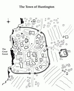
This is the first version of the map I printed. At this point I was still unhappy with the look of the map, but I could have settled for being done.
This map fulfills the function I needed. But stylistically… it needed some work. After sitting with it for a while I decided on some things I wanted to improve for the next version.
That cliff edge
The rest of the map is drawn from a top-down POV. But somehow we’re looking at the cliff from the side. While that perspective makes the feature really obvious (it’s a cliff, duh) it doesn’t fit with the rest of the map.
It also gives the wrong impression. There isn’t meant to be a steep drop-off into the Abyss — it’s just a rocky edge with a dangerous forest below.
The trees s s s s s
For this map I ended up drawing a tonne of individual trees. The trees started in town, where their individuality seemed important. But then I insisted on drawing the trees in the forest individually as well. I think the ones in town are nice, and it’s nice to have some sparse tree cover outside the walls as well. But that forest looks sad. I needed to find a better solution that makes the forest look like, um, a forest.
V2
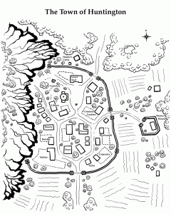
This is the second and final version of the map. I’m pretty happy with it!
Cliffs
I solved my cliff problem after many attempts. It was harder to draw the top view than I thought. One problem I kept running into was that different styles made the town look like it was at the base of a mountain instead of the top of a ledge. That optical illusion was hard to navigate in this style, but it’s very important that I made elevation clear. This map was all about clarity. And I think I did a pretty good job.
Forests (not trees)
The tree problem was much easier to deal with. I erased most of the northern trees and replaced them with a proper forest. Then I used this style in other parts of the map where there are groups of trees.
Polishing it up
I made some other choices as well: I moved some buildings around, made some of them smaller or larger. I also re-drew the “farm” lines to be a lighter weight. (I’m still not happy with those.) And finally, I thickened up the lines on the bottom sides the trees. It’s a small change but I think it makes them look much better.
And that’s it! This is the the map I printed and gave to my players. All I wanted was for them to be able to understand the layout of the town and general area, and I think I succeeded. Maybe I went a little overboard. But I had fun drawing.