I made a dice rolling app!

There are two things on my mind at all times: D&D, and web development. Sometimes I get ideas for marrying the two. Like last year, when I made a D&D reference tool. And last weekend, when I finally made a web app for rolling dice.

I’d designed the app in March. But last weekend, I finally got my stuff together and made it.

What it even does

You use it to… roll dice. Fake dice. Digital dice.

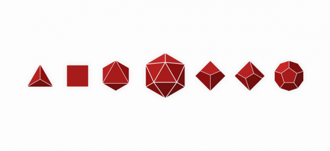
You can click on one of the seven polyhedrals to roll it. Or type in a dice expression and press Roll (or enter) to roll that too! There are many, many options you can use in your expression.

You can do anything from 1d20 (roll a 20-sided die) to 4d6d1 (roll 4 6-sided dice, drop the lowest one, then add the rest together). All the options are documented on the app’s About page — accessible by clicking on the little question mark in the bottom right corner of the screen.

Put it on your telephone!

The site is responsive (a fancy way of saying it looks good on a mobile device). Also — and I think this is super cool — you can add the page to your home screen and it behaves like a native app.

I did it on iOS through Safari, and I imagine you can do something similar in Android as well. Here are some instructions I found.. They’re from 2014, but probably still relevant?

How you even make something like this

Step one: be a nerd.

Actually though, the first thing I did was draw some wireframes in my notebook.

My initial plan was to write a program that would parse dice expressions (like 3d6+1d4+2) and generate random numbers. But then I thought that would be hard. So I checked out npm for a library that would do that for me. I found some promising packages. initially used dice-typescript but it didn’t handle invalid input very gracefully (or at all). So I switched to rolldice instead, and modified it a bit to get the verbose roll breakdown I wanted.

Oh yeah, another important thing was to design the UI. I drew some dice in Illustrator, which was weirdly a thing I’d done before. Then I designed the rest of the interface in Adobe XD, following my initial sketch pretty closely.

I planned on using Angular and hosting the final thing on github pages, so… I did. I’m all about that.

That means the project is on github! There’s no readme and I’ll probably never update it, but if you have suggestions for improvement or anything, let me know.

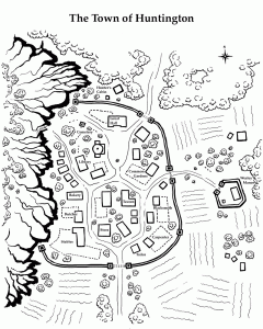
Drawing a town map for my D&D game

Last night I ran another game of Dungeons & Dragons. Last session ended badly for the players — two out of four characters died during the adventure, and the other two returned to town with only the clothes on their backs.

The adventure last night all occurred in that starting town. When we began the campaign I sketched out a few details of the town. It’s defined by its geography: it’s almost surrounded by wild lands and serves as a bridge between those who hunt, trap and find artifacts in the wilderness and greater civilization. Passing travellers stay at a tavern called The Dancing Hornet. And the town is ancient — history made its mark in the architecture and artifacts that can be found here.

But until a few days ago, I hadn’t drawn a map of it!

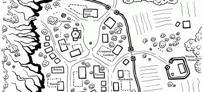
First I’ll show you the finished map. Then I’ll talk a bit about my process.

The Map

(click to see a larger size)

The Process

A list of stuff

The first thing I did was write a list of everything I knew about the town and its contents. It contained everything about the environment I mentioned a couple paragraphs ago, but also a list of buildings and features I wanted to include.

Borders
– town walls
– guard towers
– kobold cliffs (west)
– roads out of town (north & south)

Building Types
– town hall
– temple
– graveyard
– tavern
– general store
– craftspeople
– smith
– baker
– carpenter
– tanner
– butcher
– library

Out of town
– Jonas’s Manor (south east + gardens & low wall)
– hunter’s cabin (north)

Layout
– farm land (outside of town to south)
– common gardens (in town)
– stables
– town square


Rough layout

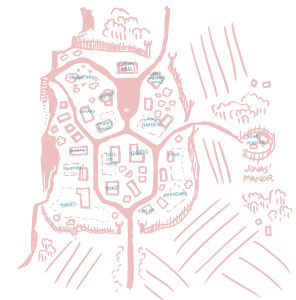
Next I opened up Photoshop, got my tablet, and started sketching!

The roads look like a weird alien. Weird……..

This first step was the basis for everything that came after so it was important to get it right. I’m not sure how long it took — maybe a couple hours? I made sure to take all my notes into account, drawing and re-drawing a layout that looks good, makes sense, and shows everything I want the players to know.

Those little blue scribbles are labels. I got them all!

Inking shapes

The next step was inking. I tweeted a picture while I was in the middle of it:

Map inking in progress

The whole point of this step is to get a cleaner line and finalize the map style. I’d made most of my decisions during the sketch, but I still needed to iterate on the look of the map.

A note about style

I had a few constrains that determined what the style for this map had to be.

First off, I knew I wanted to print it out to give it to my players. I have a black & white laser printer, so that meant the map needed to be in black & white.

The second consideration was for the purpose of the map. This is a handout for my players, which means I wanted them to easily understand the town without having to think about it. It was about utility and clarity over beauty.

that meant:

  • labels on the map instead of numbered keys
  • no roofs on buildings that would confuse the shape
  • features are more like icons than illustration — see the walls & towers
  • use of thick & thin lines to differentiate features

I’m also very influenced by the style of Runehammer’s Index Card RPG and maps by 2-Minute Table Top. So I’ve incorporated some lessons and tricks I’ve learned from both of them.

Labels

After inking the map I added labels. The title, the buildings, a compass — you know.

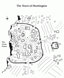
V1

This is the first version of the map I printed. At this point I was still unhappy with the look of the map, but I could have settled for being done.

This map fulfills the function I needed. But stylistically… it needed some work. After sitting with it for a while I decided on some things I wanted to improve for the next version.

That cliff edge

The rest of the map is drawn from a top-down POV. But somehow we’re looking at the cliff from the side. While that perspective makes the feature really obvious (it’s a cliff, duh) it doesn’t fit with the rest of the map.

It also gives the wrong impression. There isn’t meant to be a steep drop-off into the Abyss — it’s just a rocky edge with a dangerous forest below.

The trees s s s s s

For this map I ended up drawing a tonne of individual trees. The trees started in town, where their individuality seemed important. But then I insisted on drawing the trees in the forest individually as well. I think the ones in town are nice, and it’s nice to have some sparse tree cover outside the walls as well. But that forest looks sad. I needed to find a better solution that makes the forest look like, um, a forest.

V2

This is the second and final version of the map. I’m pretty happy with it!

Cliffs

I solved my cliff problem after many attempts. It was harder to draw the top view than I thought. One problem I kept running into was that different styles made the town look like it was at the base of a mountain instead of the top of a ledge. That optical illusion was hard to navigate in this style, but it’s very important that I made elevation clear. This map was all about clarity. And I think I did a pretty good job.

Forests (not trees)

The tree problem was much easier to deal with. I erased most of the northern trees and replaced them with a proper forest. Then I used this style in other parts of the map where there are groups of trees.

Polishing it up

I made some other choices as well: I moved some buildings around, made some of them smaller or larger. I also re-drew the “farm” lines to be a lighter weight. (I’m still not happy with those.) And finally, I thickened up the lines on the bottom sides the trees. It’s a small change but I think it makes them look much better.

And that’s it! This is the the map I printed and gave to my players. All I wanted was for them to be able to understand the layout of the town and general area, and I think I succeeded. Maybe I went a little overboard. But I had fun drawing.

Making things is harder than not making things – Part 1

I’ve started many blog-like things through the years, but I’ve written very few blog posts. Unfortunately after the initial thrill of launching a site I tend to wander off and start some other project.

I feel like this is a common experience – not only in creating a blog, but in creating anything that requires commitment over a long period of time. It’s hard to make things, especially when those things require commitment over a long period of time.

I’m writing a series about the barriers I face and how I plan to overcome them. The first post in this series is about why making stuff is so hard. The next part will be about my strategies for getting it done anyway.

So… Why is making stuff so hard?

1. Distraction

Everyone will tell you that the world is full of distractions. The Facebook! The Twitter! The cellular telephones! Yes, those things are distracting. But I was alive before social media was a whole big thing, and back then people were not 100% focused productivity machines. No matter the situation, people will always find a way to avoid difficult work.

I usually turn to Twitter when I’ve encountered a problem in the middle of a project and I don’t have an immediate idea of how to continue. I also have alerts on my phone for when certain people tweet and for emails in certain inboxes. That’s pretty stupid of me. But I don’t see my phone and Twitter as problems. They’re just the things I turn to when I’m having trouble focusing. When I’m disengaging from my work.

The first step in avoid distraction is to minimize sources of incoming messages. Turn off notifications, put my phone on silent for a while and keep it out of arm’s reach. The second step is to fully engage with the task at hand.

When I’m working on a tough coding challenge at my job, I’m 100% focused on it. Flow is a real thing. So for me, overcoming the challenge of distraction is about becoming fully immersed in the task at hand.

2. Lack of external recognition

I get the feeling that people don’t like to say this. But when you publish work on the internet, you do it because you want people to see it. You want a bunch of people to see it. And you want them to love it.

So when you’ve done something cool and put it out there, it’s a little disappointing to not be met with instant success. Even though, of course you won’t be met with instant success. That’s ridiculous.

I also struggle with to self-promotion. To me, it feels… gross? Desperate? Inauthentic? I don’t want to promote myself, yet I know that everything I see in the world is being promoted to me. And I don’t mind when they do it. How do I put my work out there in a way that doesn’t make me feel like a slimy salesman?

So. That digressed a little.

The point is that people are (I am) driven by the recognition of others. There are two ways to deal with this.

  1. Gain the recognition
  2. Stop wanting the recognition

I think the answer is to go for option 2, then produce enough work that option 1 takes care of itself. Then you’re famous! And famous people don’t have problems!!

3. I’m bad at everything

Self-doubt. Have you heard of it?

I sure have.

Is this a good sentence? Is this a good paragraph? Did I go to far with the rhetorical question thing? Do I always go too far with it? Are my sentence structures too convoluted to understand? Am I writing about anything important? Do I have a meaningful perspective? Are blogs dumb? Should I stick to web development? Am I even good at that?

If you’re me, the answer is obviously that I should stop writing, talking, and everything else. Because I’m bad at it. And I might get better, but not that much better. And by the time I’m a little better I’ll still be so far behind everyone else. So I should stop now before I make a fool of myself.

Funnily enough, I see myself as having a growth mindset. A new challenge isn’t a test of my inborn ability — it’s an opportunity to learn, to grow, and develop strategies that apply to all aspects of my life.

I think anyone can develop a skill. The people we see as “talented” have just been practicing for a very long time. They may have shown an interest from a young age, worked slightly harder than their peers, and been praised for their work, spurring them to keep practicing and getting better in a positive feedback loop.

I have that attitude towards specialized knowledge as well. A doctor or a scientist is just someone who decided to study different things and read different books than I did. If I spent 8 years studying something else, I could be a scientist too.

But then I think… if they studied my field for the same amount of time, they could do what I do. I’m only a math person because I believe I am one. And I made my choices. I spent my days learning about making websites, not writing, or art, or games, or science. (Except all the time I spent leaning about art & writing & games that I should have spent coding.)

So that’s my deal with that.

4. Motivation

The beginning of a project is the best time. You have an idea with unlimited potential. But after you start the work, the unlimited possibilities are reduced to decisions. And compromises. And regrets.

I relish technical challenges. After all, I am a web developer. The beginning of a personal blog project is all about learning exciting new things. Figuring out hosting and domain names or a new platform; learning about a CMS; agonizing over my site’s design and figuring out how to hack the theme to get everything just the way I want it. I’ve even created WordPress themes from scratch. Because it’s fun.

Web projects come with fun parts and boring parts.

Fun parts:

  1. Getting the first spark of inspiration down on paper (yes I use paper)
  2. Designing the look and feel
  3. Designing the architecture
  4. Developing the core functionality
  5. Styling the main design elements
  6. Adding some cool animations

Not fun parts:

  1. Designing the fiddly bits
  2. Making 1000 assets
  3. Fixing bugs in Internet Explorer
  4. Developing everything that’s necessary, yet unsexy, that you’ve done 1000 times before
  5. Styling every single html element that could possibly be used in a content-managed text section
  6. Internet Explorer

It just so happens that the fun parts come at the start of the project and the boring parts happen at the end. So if you’re like me, you like to do the fun, big-picture planning… then get into some cool development… and make that thing look how you dreamed (at the top)… then add some pop… then realize that the fun part is over and all that’s left is hard work.

And then find some other cool idea to work on.

This is why I have 20 unfinished projects and 0 finished ones.

5. Fear of being vulnerable

I see other people’s blogs as extensions of their identities. Or even the whole of their identity. (It’s hard not to, if all you know about someone is what they write on the internet.) It follows, then, that my blog represents my identity to other people.

You start a blog by writing a single post. Then that first article is your whole blog. And if your blog represents you, then until you write a second post, your entire self is defined by the first article you’ve written.

That’s a lot of pressure.

And if you’ve read the “I’m bad at everything” section above, you’ll understand why this is so daunting.

Does your online presence define who you are? To other people, maybe. Other people’s opinions of you are always going to be shaped by what you externalize. Your clothes, your haircut, your posture are what a person on the street sees. You Twitter, Instagram, and dumb blog are the digital version of that. I guess.

Anyway I’m notoriously guarded. I portray that in life whether I want to or not. The way to be guarded on the internet would be to not post at all. That’s at odds with writing a blog. Especially an authentic blog that people like. (See “external recognition” above.) So this is something I need to work on.


In this article I have delivered 5 problems and 0 solutions. You’re welcome.

Tune in next time for at least one solution. No promises.